

Have you ever gone to a large city and noticed the amount of sculptures, gardens, and murals there are? Why is all of this great public art in large cities? It might be that large cities have a budget for public arts, and they have a large platform that many tourists and visitors pass by and view. Public Art is an important feature in all communities though, it can bring people together or just start conversation. Smaller cities and towns need the effects of public art just as much a large cities, so why is there less public art in smaller communities? Rally behind your local public arts projects and embrace the beauty and conversation that will follow.

Window - Seeing Design In A New Light

Window: an opening in the wall or roof of a building or vehicle that is fitted with glass or other transparent material in a frame to admit light or air and allow people to see out or in.
Looking out of a window and looking into a window generate different feelings. Looking out of a window provides a feeling of dominance of the interior space you are in. Looking into a window is to look in on something personal of someone else's or your own. You see an outer perspective through a window which leads to something personal. A window for others to intentially look through can generate an immediate varied perspective depending on what the window in framing. Offering a window for potential customers to view a brand or a business is essential in creating a representative design. How and what you frame with that window dictates the presence of the brand.
Identifying the Elements

Break it down. All things are made up of elements, so is design. Design is made up of multiple elements, some designs have more elements than others. Look at a design that you really love. Now identify the elements of that design. What types of lines are being used, what colors, how are the elements organized in the space, what and where is the focal point, what elements support that point to make it the focal point? Identify what you like about a design or what elements a client likes in design to incorporate these key elements of your next creation.
Studio Joie De V

Studio Joie De V, bringing an upbeat approach to classical pilates. Calle Bonita Studios (CBS) is excited to present Studio Joie De V's re-vamped website. CBS created the web design in collaboration with Allison Howie, owner of Studio Joie De V. Allison's light filled studio is an amazing space to clear your mind and get to work on the Pilates reformer. With Allison's clear vision and clean esthetic, CBS was able to create a website that introduces the peaceful space before actually stepping foot into the studio. Visit www.studiojoiedev.com for more information and to sign up for a class with Allison.
FORM

A shape, a body, a mold, a mode; form. Form, as a noun, is based on the outer line of a form. When a form is translated into a three-dimensional shape, shadow and highlights appear creating visual interest. When a form is translated in two-dimensional, shadow and highlights must be created to add visual interest. When form is thought of in such a minimalist way, the objects arounds us can take on new meaning. Letting form take the foreground can be just as interesting as form being the vessel for shadow and light.
IMPRESSIONS

Impressions: A strong effect produced on the intellect, feeling, conscience, etc.
Working in clay is a humbling reminder of how easy it is to make an impression. It is also a reminder of the amount of skill it takes to create the desired impression. Physical impressions are on almost every surface that we interact with: the grout lines in the floor we are standing on, the texture of the walls, the tread on the tires that take us from place to place. Some of these impressions are more functional than decorative, but they all started by altering an object/surface/idea that was flat and non-descript.
THE NOT SO CIRCLE OF DESIGN

The process of design is so varied from person to person, is there a fundamental process to design? Like life, is there a circle of design?
Being creative is called a number of things, a skill, a gift, a character trait, ect. For each person the process of being creative cannot be the same, just as the act of being creative is just a varied. Even the end result is varied in the creative world. A logical thought is that the goal of all design is a complete or finished project. Although, for many creatives the process of exercising a creative thought is the goal. Not all processes must make universal sense, but they must make us critically evaluate the results, whatever they may be.
BONNIE ESTATES

Logo and label for small production winery. Calle Bonita Studios created the Bonnie Estates logo and wine label with a modern and playful feel to attract the millennial wine enthusiast.
LookUp

Research. Research. Research. To create with intent, you must have done some research on the subject matter or medium in which you are creating. Sure creating with no purpose can be freeing and in the moment, but will that work have the lasting impression that all great work does? Research can only help develop a thought or an idea, so why not use research to develop design too?
DUALITY

Duality: the quality or state of having two parts.
Duality. Is there a better time to talk about duality than mid-week? Just like in human nature, duality is a constantly reoccurring element of design. Even in early religious art, the theme of duality is a focal point.
Duality in art and design makes a statement. Sparking conversation can be an effective strategy in branding. Although, make sure you are sparking the right conversation with your statement.
MESITA

Mesita, meaning little table in Spanish. This young, small scale, vineyard creates beauty by cultivating less than desirable soil to work for their vines.
Logo and wine label created by Calle Bonita Studios.
SYMMETRY

Symmetry: the quality of being made up of exactly similar parts facing each other or around an axis.
When something looks visually pleasing there is often a level of symmetry involved. Perfect symmetry though, can confuse the eye. Adding a focal point to direct the eye is essential if there is an element of focus that should be created. Symmetry can also be lost if there is no object to focus on. Don’t let perfect symmetry take over the image. Let symmetry contribute to the overall goal, but not be the leading scorer.
VISION
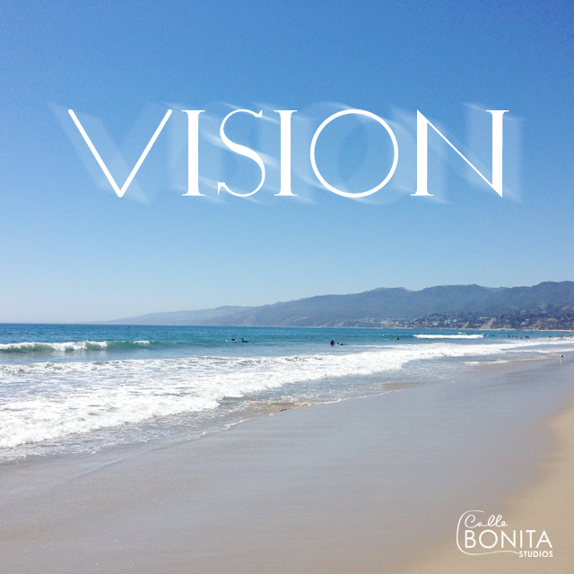
Developing a clear vision can be a challenge for both designer and client. Some clients can come to you with a clear vision. You have two options then, create exactly that vision or create a version of their vision developed beyond their expectation. In the end it’s up to the client to choose their vision for their brand, but showing a few options can never hurt.
Pattern Me Pretty
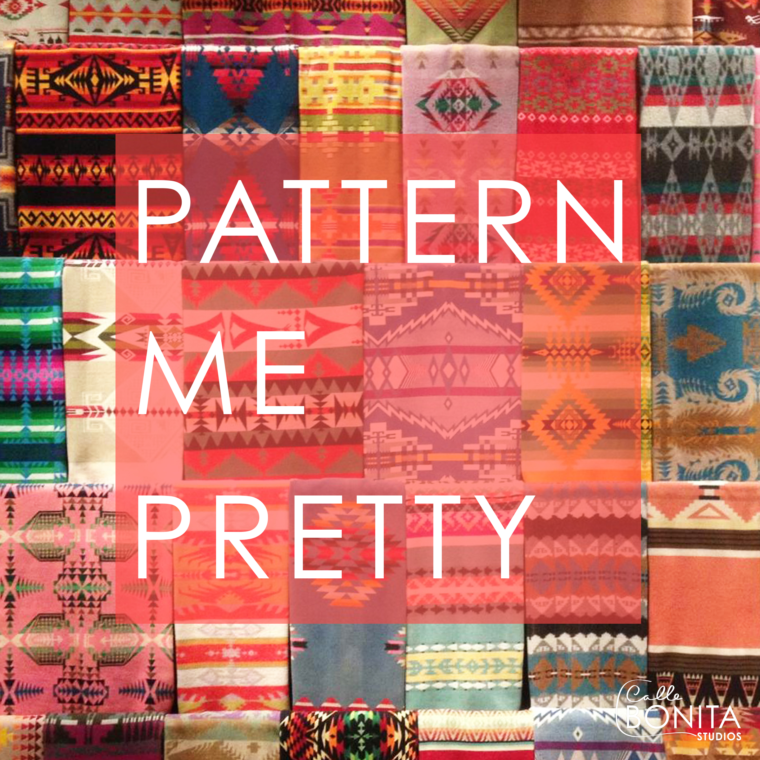
Pattern: The composition of structural features such as color, line, texture, and shape.
Patterns are everywhere. I mean everywhere! Patterns can be composed, in nature, in science, in mathematics, in poems, and even in negative space. There are so many possible inspirations for developing a pattern. Where to start?! My processes stars by deciding if the pattern will be a primary pattern or a secondary pattern. My next step is letting my creativity run wild with inspiration while keeping the project objective in prospective.
#DesignGoals

Goals: A desired result achieved by implementing a plan to reach a final objective.
What is the goal of your current design project? The answer should come easily, but often it doesn't. Design goals are often multi-faceted. We can create work that solves on goal, but does it create problems in the larger picture? Broadening your focus and critically solving each design challenge with the larger context in prospective, will save time and money.
def. of CREATIVITY: PLAY

People have defined creativity before. Is creativity as easily defined as we may think? No. The act of being creative is as diverse as every person who has had a creative thought. There is an infinite number of mediums to express creativity, so play. Play to create. Creativity is not madness. Madness is not fulfilling creativity.
PERSPECTIVE

Perspective: Any method by which a three-dimensional space is represented on a flat surface. Linear, aerial (or atmospheric), isometric, cabinet, and reverse perspective are most commonly used.
The air that we see in the paintings of the old masters is never the air that we breathe. - Edgar Degas
Having perspective in visual design, is creating visual context for the viewer. By creating the appropriate perspective you are able to depict a scene with greater realism, and hopefully creating more than just a visual experience. When an artist has the ability to create great perspective the viewer can ofter feel drawn or pulled in to the artwork, or even that they are placed within the artwork. Each medium of art has many was of creating perspective, but it is a true skill to develop overwhelming real perspective.
INFORMAL BALANCE
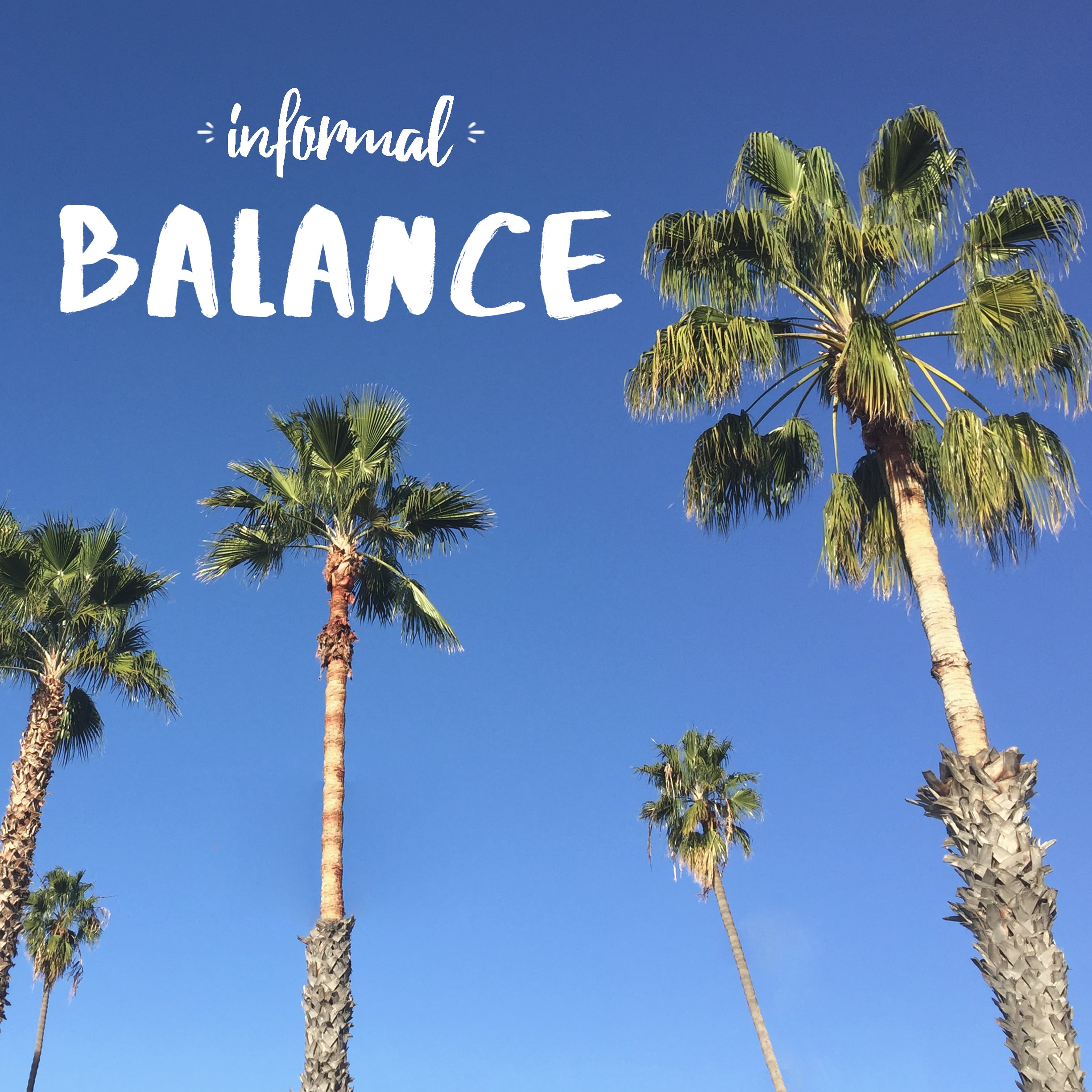
Informal Balance: A casual, unpredictable distribution of visual weight which does not use opposing halves. It is usually devised by intuition rather than analysis, and in visual esthetic design, it may be used more frequently than symmetrical and asymmetrical balancing schemes.
Most of us try to achieve balance in our lives, whether it is physical or emotional. If only we looked up every once in a while, we’d realize that balance is all around us; it might be informal, but it’s there. Great branding allows us to envision a certain brand or company’s products embedded in our own lives. One technique to achieve this is informal balance. The juxtaposition is not blatantly symmetrical or explicit, but natural. It looks like the product or brand being sold could just slide right in to your life without conflict. Sounds easy, but even informal balance is designed with thought and intention. You just need to find it.
SIMULTANEOUS CONTRAST IN THE WILD
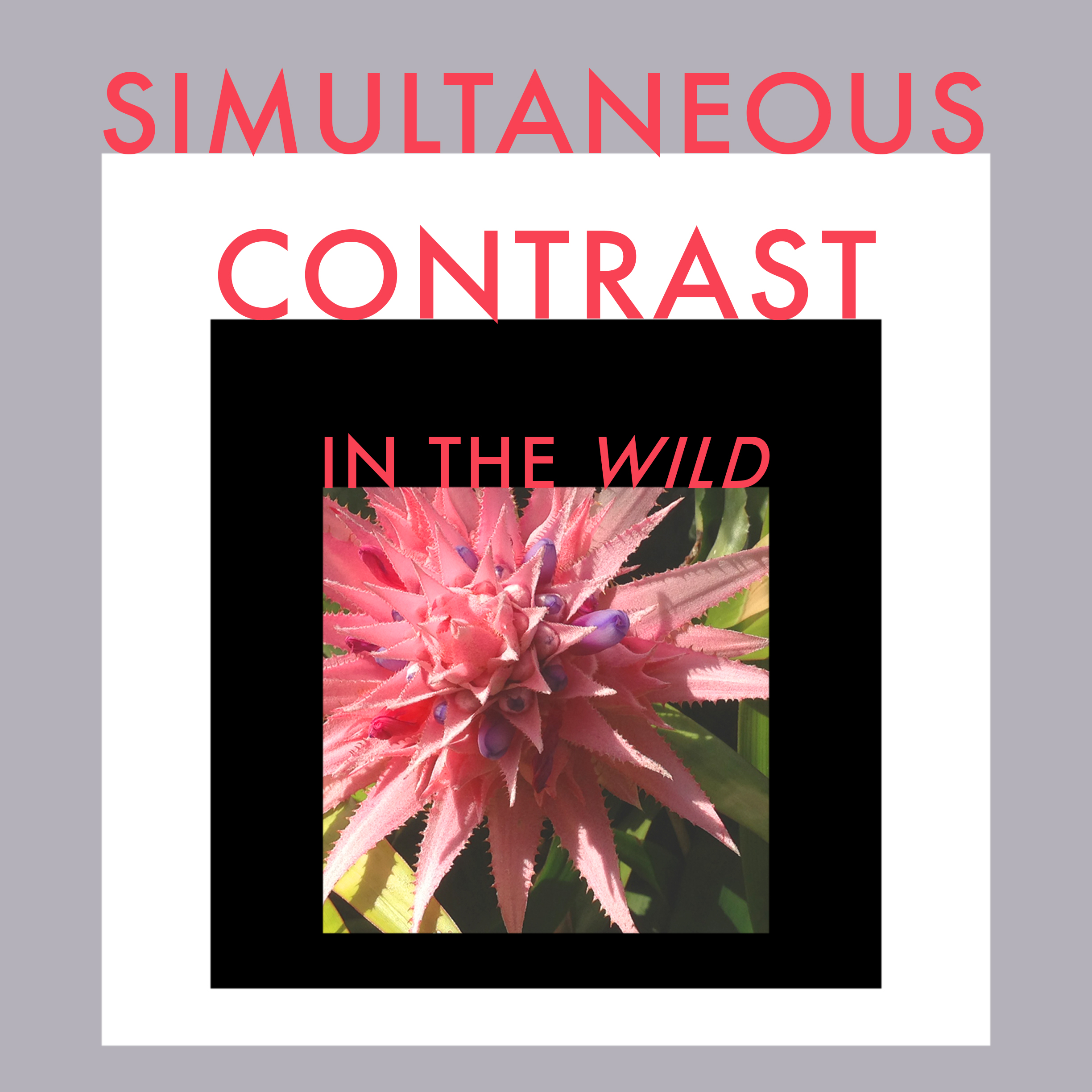
Simultaneous Contrast of Value: Alterations in the appearance of color caused by changing its background or surroundings. The resulting modifications are somewhat predictable, in that when things are juxtaposed their differences will be heightened.
The exploration of color is unbound. Josef Albers shows us that a single color is only as we see it because of the relationship to the color surrounding the object. The theory of simultaneous contrast holds true in the wild also. We may remember a certain vividness of a coral flower when placed among greenery in a tropical forest, but when the same flower is brought back and placed in a beige room the vivid hue is lost. This difference in color is not due to the flower, it is because of the flowers surroundings.
In branding we must choose our colors wisely. The primary foreground colors are important, but the background colors are equally important when being brand identity.
Color + Context - Elements of Design

CONTEXTUALISM: The general idea that the nature of things can only be described or known in relations to (by comparing them with) other things or contexts. To follow, things may change in appearance when they are extracted from one environment and displaced to another.
When presented with a new design project the importance of context is irrefutable. Starting a project with a color scheme without any context can be distracting and unproductive as the color scheme may not relate to the context of the project. Starting a project with visual context and narrative is primary when creating a design with purpose. The introduction of color in design is what reinforces the the design project goal.